How To Create a Neumorphic Design with Flutter
Soft UI is a design trend in 2020 and it has to do with a lot of working with shadows and gradients however, people find it difficult to implement it in Flutter. These kinds of designs are called Neumorphic design.
In this tutorial, we will create a Soft UI design in Flutter using the available tools that come with Flutter’s awesomeness.
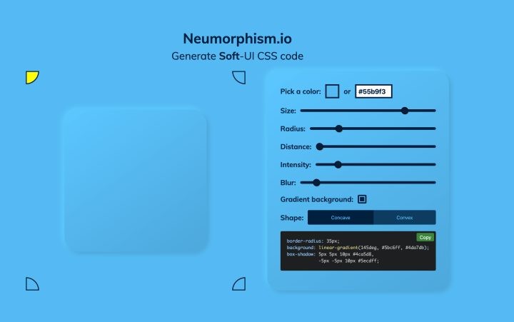
Head over to neumorphism.io to create a Soft UI design like below. Once you are satisfied with the way it looks, you can now go ahead and implement it in Flutter.
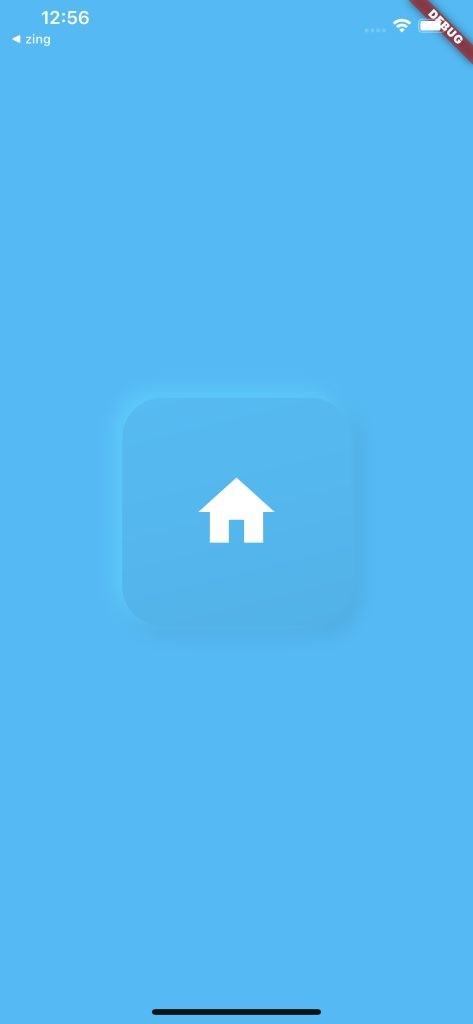
Take a look at the design we will be replicating using Flutter.
First, create a Flutter project and call it any name you like. In my case, I call it Soft UI.
Once your project has been created, you want to get rid of the boilerplate code in your main.dart file. Edit the file to look like the code below. What I have done is to create another file called home.dart. This is where the magic for creating these design happens.
main.dart
void main() => runApp(MyApp());

class MyApp extends StatelessWidget {
  // This widget is the root of your application.
  @override
  Widget build(BuildContext context) {
    return CupertinoApp(
      title: 'Flutter Demo',
      home: Home(),
    );
  }
}
Notice that I am returning a CupertinoApp instead of a MaterialApp widget in the build context. It is fine if you opt for MaterialApp widget.
The home property of the CupertinoApp Widget has a reference to home.dart which will hold the code for the soft UI design.
Create a stateless widget called home.dart and make sure you reference it correctly in your main.dart widget.
Design implementation
First, we return a Scaffold widget with a background colour of #55b9f3. This is the colour of the whole page.
return Scaffold(
backgroundColor: Color(0xFF55b9f3),
)
Next, we set the body property of our scaffold widget to a Container. This is where the bulk of the work is. The container widget is very important for creating a neuromorphic design and according to Flutter’s documentation, the container is a convenience widget that combines common painting, positioning, and sizing widgets.
The most important property of this widget is the decoration property which allows you to decorate the Container’s child and it allows you to paint behind the child. Let’s give the container height and width of 200.
return Scaffold(
backgroundColor: Color(0xFF55b9f3),
body: Center(
child: Container(
height: 200,
width: 200
)
)
)
Now, let’s style the container with a decoration property.
decoration: BoxDecoration(
              gradient: LinearGradient(
                  begin: Alignment(-1.0, -4.0),
                  end: Alignment(1.0, 4.0),
                  colors: [
                    Color(0xFF5bc6ff),
                    Color(0xFF4da7db),
                  ]),
              borderRadius: BorderRadius.all(Radius.circular(35)),
              boxShadow: [
                BoxShadow(
                    color: Color(0xFF4ca5d8),
                    offset: Offset(5.0, 5.0),
                    blurRadius: 15.0,
                    spreadRadius: 1.0),
                BoxShadow(
                    color: Color(0xFF5ecdff),
                    offset: Offset(-5.0, -5.0),
                    blurRadius: 15.0,
                    spreadRadius: 1.0),
              ]),
The decoration property takes a BoxDecoration widget with gradient, borderRadius and boxShadow property exactly as we have it in neumorphism.io.
border-radius: 35px;
background: linear-gradient(145deg, #5bc6ff, #4da7db);
box-shadow: 5px 5px 10px #4ca5d8,
            -5px -5px 10px #5ecdff;
We can already see a pattern of converting the CSS classes into dart code. The border-radius property is equivalent to BorderRadius.all(Radius.circular(35)) while the background property is of linear-gradient which is equivalent to the LinearGradient in Flutter. The box-shadow CSS property is equivalent to the boxShadow property in Flutter and this property takes a list of BoxShadow widgets.
The full implementation will look as below:
return Scaffold(
      backgroundColor: Color(0xFF55b9f3),
      body: Center(
        child: Container(
          height: 200,
          width: 200,
          child: Icon(
            Icons.home,
            size: 80,
            color: Colors.white,
          ),
          decoration: BoxDecoration(
              gradient: LinearGradient(
                  begin: Alignment(-1.0, -4.0),
                  end: Alignment(1.0, 4.0),
                  colors: [
                    Color(0xFF5bc6ff),
                    Color(0xFF4da7db),
                  ]),
              borderRadius: BorderRadius.all(Radius.circular(35)),
              boxShadow: [
                BoxShadow(
                    color: Color(0xFF4ca5d8),
                    offset: Offset(5.0, 5.0),
                    blurRadius: 15.0,
                    spreadRadius: 1.0),
                BoxShadow(
                    color: Color(0xFF5ecdff),
                    offset: Offset(-5.0, -5.0),
                    blurRadius: 15.0,
                    spreadRadius: 1.0),
              ]),
        ),
      ),
    );
When you run this code in the emulator, you will have the image below.
In conclusion, creating neumorphic design widget requires you to wrap the widget in a Container then play around with the decoration property.
You can grab the full implementation of this tutorial on Github here.


