CSS box-sizing Property – explained
The box-sizing property CSS defines how the width and height of an element are calculated, that is, should they include padding and borders, or not.
Contents
- Introduction
- Box-sizing values
- Without the CSS box-sizing Property
- With the CSS box-sizing property
- Box-sizing reset Methods
- Conclusion
Introduction
The box-sizing property can make building CSS layouts easier and a lot more intuitive.
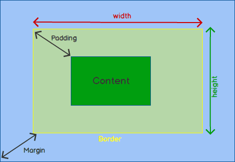
The box-model looks like:

Box-sizing values
inherit: Inherits the box-sizing of the parent element.border-box: Width and height values apply to the content, padding, and border.content-box: Width and height values apply to the element’s content only. The padding and border are added to the outside of the box.content-boxis the default value ofbox-sizing.padding-box: Width and height values apply to the element’s content and its padding. Butpadding-boxis now deprecated and should no longer be used.
By default, the width and height of an element is calculated like this:
width + padding + border = actual width of an element
height + padding + border = actual height of an elemen
Without the CSS box-sizing Property
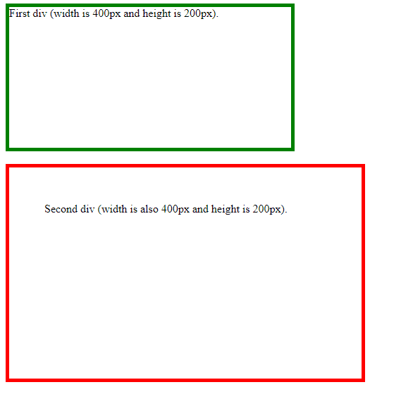
Consider this example:
.div1 {
   width: 400px;
   height: 200px;
   border: 5px solid green;
}

.div2 {
   width: 400px;
   height: 200px;
   padding: 50px;
   border: 5px solid red;
}
The second <div>, red div, has padding specified. That’s why the two <div> elements above end up with different sizes in the result. To fix this problem we use border-sizing .
With the CSS box-sizing property
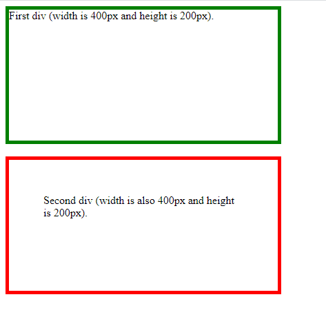
If we set box-sizing: border-box; on an element, padding and border are included in the width and height:
.div1 {
     box-sizing: border-box;
     width: 400px;
     height: 200px;
     border: 5px solid green;
}

.div2 {
   box-sizing: border-box;
   width: 400px;
   height: 200px;
   padding: 50px;
   border: 5px solid red;
}
Box-sizing reset Methods
Since the result of using the box-sizing: border-box; is so much better, many developers want all elements on their pages to work this way.
Applying this to all elements is wise and safe:
* {
  box-sizing: border-box;
}
This works fairly well, but it leaves out pseudo elements, which can lead to some unexpected results.
You can use the code bellow:
*, *:before, *:after {
  box-sizing: border-box;
}
This method selected pseudo-elements, improving the normalizing effect of border-box. But, as you can see, the * selector makes it difficult to use content-box or padding-box elsewhere in the CSS.
Which brings us to the current frontrunner for best practice:
html {
  box-sizing: border-box;
}
*, *:before, *:after {
  box-sizing: inherit;
}
This reset gives us more flexibility than its predecessors without worrying about a universal selector overriding our CSS.
Conclusion
box-sizing: border-box; is supported in the current versions of all major browsers. The less-commonly used is padding-box, it only supported in Firefox at the moment. You can continue learning about CSS here.
Thanks for reading!
