Building a Portfolio Website with Vue and Bootstrap
This tutorial is targeted at developers who know the basics of Bootstrap and Vue.js framework but need a practical example to properly grasp the above technologies.
If you are an absolute beginner, I would suggest you take some absolute beginner crash courses before heading over to this. With that said, Let’s get started.
Before we kick off
Learn Vue.js and modern, cutting-edge front-end technologies from core-team members and industry experts with our premium tutorials and video courses on VueSchool.io.
Introduction:
In the field of software development and computer programming, one cannot fully grasp the techniques and skills required without hands-on practical knowledge.
You should know the theory but most importantly, you should build something with it.
Today, we will be building a portfolio website with Vue.js and Bootstrap. Let’s get to it.
Create a new Vue project:
We will be creating a new Vue project using Vue CLI (command-line tool for Vue.js development). To install Vue CLI if you do not have it installed already, Click here to follow the instruction.
Now let’s create our new Vue project with the following command:
vue create vue-portfolioSelect the manual option when prompted to complete the installation.
In your terminal, navigate to the project and start the Vue development server like so:
Npm run serve This would start our Vue project development server in the following port address: http://localhost:8080/
Include Bootstrap:
Bootstrap will be used to style our project. For we to be able to use bootstrap, we must first add it to our project. There are many ways to add bootstrap to a Vue.js project. For the purpose of this tutorial, we will use the Bootstrap CND (content delivery network). For other methods of adding Bootstrap to a project, head on to the bootstrap official documentation.
To add bootstrap using CDN, add the following to your index.html file in the public folder of your project.
Add this to the head section :
<!-- bootstrap -->
<link rel="stylesheet" href="https://stackpath.bootstrapcdn.com/bootstrap/4.3.1/css/bootstrap.min.css" integrity="sha384-ggOyR0iXCbMQv3Xipma34MD+dH/1fQ784/j6cY/iJTQUOhcWr7x9JvoRxT2MZw1T" crossorigin="anonymous">
Add this to the bottom of the body tag :
https://code.jquery.com/jquery-3.3.1.slim.min.js
    https://cdnjs.cloudflare.com/ajax/libs/popper.js/1.14.7/umd/popper.min.js
    https://stackpath.bootstrapcdn.com/bootstrap/4.3.1/js/bootstrap.min.js
Creating our Navigation Component(Nav):
Let us add a simple navigation bar to our project using Bootstrap. Our navigation bar (nav-bar) would need to appear on every page of our website.
Since we are using Vue, Let us create a new component for our Navbar. Head on to the components folder in your project and create a new folder. I would name my folder includes. You can name yours whatever you like. In the newly created folder, create a new Vue component for our Navbar. I named mine navigation.vue.
In your navigation.vue component, add the following to create simple Bootstrap navigation:
<template>
    <div>
        <nav class="navbar navbar-expand-lg navbar-light bg-light">
            <button class="navbar-toggler" type="button" data-toggle="collapse"
              data-target="#navbarTogglerDemo03"
              aria-controls="navbarTogglerDemo03"
              aria-expanded="false" aria-label="Toggle navigation">
              <span class="navbar-toggler-icon"></span>
            </button>
            <a class="navbar-brand" href="#">Navbar</a>
            <div class="collapse navbar-collapse" id="navbarTogglerDemo03">
                <ul class="navbar-nav mr-auto mt-2 mt-lg-0">
                <li class="nav-item active">
                    <a class="nav-link" href="#">
                      Home
                    <span class="sr-only">(current)</span></a>
                </li>
                <li class="nav-item">
                    <a class="nav-link" href="#">Link</a>
                </li>
                <li class="nav-item">
                    <a class="nav-link disabled" href="#">Disabled</a>
                </li>
                </ul>
            </div>
        </nav>
    </div>
</template>
Now, we need to import our navigation component into our App.vue component. Add the following to your App.vue script section.
<script>
import Navigation from './components/includes/nav.vue' //import the component

export default {
  name: 'App',
  components: {
    Navigation  //instantiate it here
  }
}
</script>
Now we need to use the Navigation component in the template section of the App.vue component like so:
<template>
  <div id="app">
    <navigation/> //using the navigation component in the template section
  </div>
</template>
Let us progress by adding, Vue router.
Adding Vue Router:
We need to navigate within our app. We need to install and configure Vue router to achieve this. Let’s install Vue router using npm like so:
npm install vue-router After installing, create a router.js file at the root of your project src folder and modify it like so:
import Vue from 'vue';
import VueRouter from 'vue-router';
Vue.use(VueRouter);
let router = new VueRouter({
    routes:[
        {path:'/',  name:'Landing', component: () =>import('./components/Lander')},

    ]
});
export default router;
From the above code base, notice how we imported the Lander component in the route array. I personally like to do it this way because I think its cooler and you get to write less. If you are familiar with vue router and want to do it the other way, its fine.
We have not created our Lander.vue component. To do so, head on to the components folder and create a new file named Lander.vue
We need to make our router globally accessible in our project by importing it into our App.vue component like so:
import router from './router' //import router.js into main.js
new Vue({
  render: h => h(App),
  store,
  router //added router instance
}).$mount('#app')
Fleshing out our Lander.vue component:
It’s time to actually start fleshing out our portfolio site. Let’s start by adding our first section. Add the following to your lander.vue component.
<template>
    <div>
        <section class="section">
            <div class="container-fliud">
                <img alt="Vue logo" class="rounded-circle" src="https://upload.wikimedia.org/wikipedia/commons/thumb/1/1f/Woman_1.jpg/220px-Woman_1.jpg">
                <h1>Software Developer</h1>
                <p>This is a fun project I built while learning
                   vue.js and bootstrap
                </p>
                <button type="button" class="btn btn-primary btn-lg">
                  Contact
                </button>
            </div>
        </section>
    </div>
</template>

<style lang="css" scoped>
    .section{
        padding-top: 10%;
        padding-bottom: 10%;
    }
</style>
Your code should look like mine at this point.
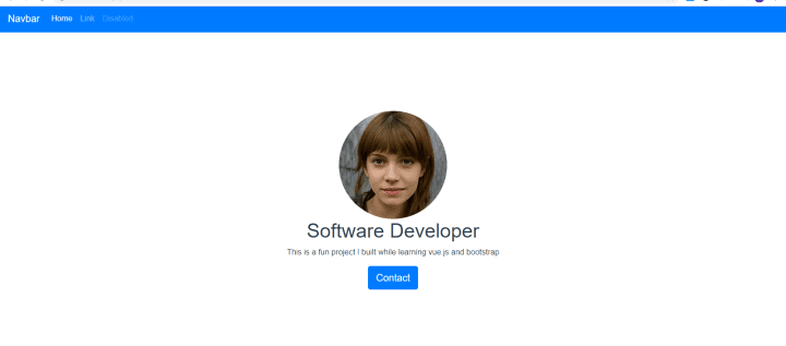
Here we created a custom class of section used to add padding to our page. The container-fluid class is a bootstrap class that does exactly what the name says. It is a container for the rest of the elements in the section. It stretches to the end of the page. The difference between the container and the container-fluid class is that container-fluid stretches to the end of the page while container gives padding to elements. The circle-rounded class added to the image gives it a border-radius of above 50% making its edges rounded. The button is a basic bootstrap button. Lets proceed.
Adding the portfolio section:
Every portfolio website should obviously have a portfolio section to showcase previous jobs. Let’s add one to our project.
Add the following code blocks to the template section:
<section class="protfolio">
            <h1>Portfolio</h1>
            <p>These are suppose to be sample projects</p>
            <div class="container">
                <div class="row">
                    <div class="col-md-4">
                            <div class="card">
                                <div class="card-head">
                                    <img alt="Vue logo"
                                      class="rounded-circle img-custome"
            src="https://www.wetechnology.cz/wp-content/uploads/2017/02/uxui.jpg">
                                    <h2>web project</h2>
                                </div>
                                <hr>
                                <div class="card-body">
                                    <p>
                                        Donec sed odio dui.
                                  Etiam porta sem malesuada magna mollis euismod.
                          Nullam id dolor id nibh ultricies vehicula ut id elit.
                                Morbi leo risus, porta ac consectetur ac,
                            vestibulum at eros. Praesent commodo cursus magna.
                                    </p>
                          <button type="button" class="btn btn-outline-secondary">
                            More
                            </button>
                                </div>
                            </div>
                            <br>
                    </div>
                    <div class="col-md-4">
                            <div class="card">
                                <div class="card-head">
                                    <img alt="Vue logo" class="rounded-circle img-custome" src="https://i.pinimg.com/originals/4a/70/56/4a70563234301578c158dc142384a1c3.png">
                                    <h2>web project</h2>
                                </div>
                                <hr>
                                <div class="card-body">
                                    <p>
                                        Donec sed odio dui. Etiam porta sem malesuada magna mollis euismod.
                                        Nullam id dolor id nibh ultricies vehicula ut id elit.
                                        Morbi leo risus, porta ac consectetur ac, vestibulum at eros. Praesent commodo cursus magna.
                                    </p>
                                    <button type="button" class="btn btn-outline-secondary">More</button>
                                </div>
                            </div>
                        <br>
                    </div>
                    <div class="col-md-4">
                        <div class="card">
                            <div class="card-head">
                                <img alt="Vue logo" class="rounded-circle img-custome" src="https://cdn.mos.cms.futurecdn.net/wH5y2PkWhCxqKBje8rBp5e.jpg">
                                <h2>web project</h2>
                            </div>
                            <hr>
                            <div class="card-body">
                                <p>
                                    Donec sed odio dui. Etiam porta sem malesuada magna mollis euismod.
                                    Nullam id dolor id nibh ultricies vehicula ut id elit.
                                    Morbi leo risus, porta ac consectetur ac, vestibulum at eros. Praesent commodo cursus magna.
                                </p>
                                <button type="button" class="btn btn-outline-secondary">More</button>
                            </div>
                        </div>
                    </div>
                </div>
            </div>
        </section>
I added a few custom styles to spice things up a little. Add the following CSS classes to your styles as well:
.protfolio{
        background-color: #34345238;
        padding-top: 8%;
        padding-bottom: 15%;
        /* padding:15% */
    }
    .img-custome{
        width: 140px;
        height: 140px;
        margin-top: 15px;
    }
your portfolio section should look like so:
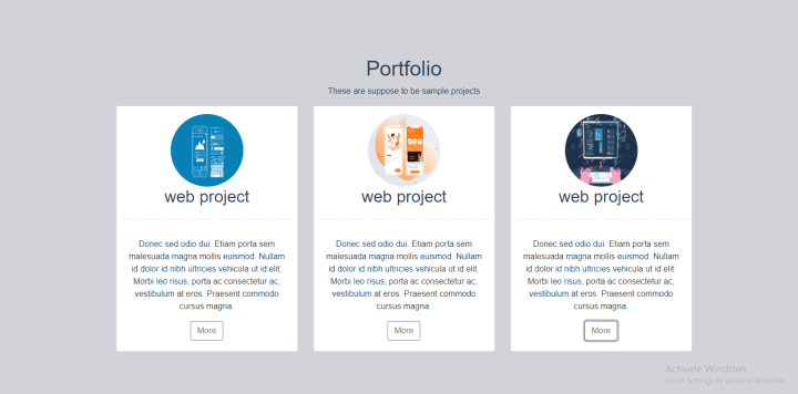
We used the bootstrap grid system to achieve the layout above. Notice how we created a div with class of row then added the following three (3) div’s with class of col-md-4 before adding the card div‘s.
The div with the class of row assigns a row of 12 columns to the project. We shared these 12 columns into 3 large columns by using the col-MD-4 class on each of the div’s holding our cards.
All these are core bootstrap features that are explained in detail in the bootstrap documentation. Do well to check it out if you have not fully understood the bootstrap grid system or any of the techniques we used above.
We added a background color to the section and made the images responsive using the .protfolio and the .img-custome . These are not bootstrap classes. We had to add them to spice up our project.
Creating the contact us section:
Let’s do something different here. Our contact form would be in a different component. We would get it to show in a bootstrap modal.
Create a new vue.js component in the component folder. I’ll call mine contact.vue Let us create a contact form using bootstrap in the component folder like so:
<template>
    <div>
        <div class="container" style="padding:10%">
            <h2>Contact Me</h2>
            <form action="mailto:alloyking1@gmail.com"
              method="post" enctype="text/plain">
                <div class="form-group">
                    <input type="email" class="form-control"
                      v-model="contact.eamil" placeholder="Enter email">
                </div>
                <div class="form-group">
                    <textarea class="form-control"
                    v-model="contact.message" rows="3" placeholder="write message">
                    </textarea>
                </div>
            </form>

            <button type="button" @click="submit" class="btn btn-primary btn-lg">
                Contact
            </button>
        </div>
    </div>
</template>


<script lang="ts">
export default {
    data(){
        return {
            contact:{
                email:'',
                message:''
            }
        }
    },

    methods:{
        submit(){
            //validating the form
            if(this.contact.eamil !="" && this.contact.message != ""){
                // send details to email
            }else{
                alert("All fields are required");
            }
        }
    }
}

</script>
Besides the bootstrap classes used to style the form, you would notice a v-model property on each form filed which was used to binned the values in the form field to the contact object in the data function.
//we used v-model to bined the follow to form fields.
data(){
        return {
            contact:{
                email:'',
                message:''
            }
        }
    },
we also carried out a very basic form validation for the form. The logic for this was done in the submit method like so:
methods:{
        submit(){
            //validating the form
            if(this.contact.eamil !="" && this.contact.message != ""){
                // send details to email
            }else{
                alert("All fields are required");
            }
        }
    }
We need to include our contact.vue component in the lander.vue component and display it in a bootstrap modal when the contact-us button is clicked. Add the following to the script section of your lander.vue component.
<script lang="ts">
import Contact from './Contact.vue'
export default {
    name:'Lander',
    components:{
        Contact
    }
}
</script>
in the template, add a new section like so:
<!-- modal for contact -->
<section class="">
      <div class="modal fade bd-example-modal-lg" tabindex="-1"
          role="dialog" aria-labelledby="myLargeModalLabel" aria-hidden="true">
              <div class="modal-dialog modal-lg">
                    <div class="modal-content">
                        <contact/>//where we utilized the newly imported component
                    </div>
              </div>
        </div>
</section>
We added a bootstrap modal to the section and used the contact.vue component in it. We need a way to open the modal. Lets edit the contact us button in the lander section to open and close the modal.
<button type="button" class="btn btn-primary btn-lg" data-toggle="modal" data-target=".bd-example-modal-lg">Contact</button> The data-toggle and data-target does all the magic. Your project should look like the image below when the contact-us button is clicked:
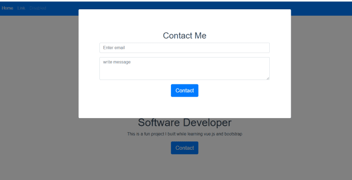
For the purpose of this tutorial, we would not cover sending email from our contact form. You can use simple PHP or any JavaScript library our there. I’ll leave that to you, explore and figure something out.
The Footer:
Our project looks cool but something is missing. Let’s add a footer to spice it up the more. Create a new component in the includes folder we created earlier. I’ll call mine Footer.vue
Lets flesh out our footer using bootstrap like so:
<template>
    <div>
        <footer class="container py-5">
            <div class="row">
                <div class="col-12 col-md">
                <small class="d-block mb-3 text-muted">© 2017-2018</small>
                </div>
                <div class="col-6 col-md">
                <h5>Features</h5>
                <ul class="list-unstyled text-small">
                    <li><a class="text-muted" href="#">Cool stuff</a></li>
                    <li><a class="text-muted" href="#">Random feature</a></li>
                    <li><a class="text-muted" href="#">Team feature</a></li>
                    <li><a class="text-muted" href="#">Stuff for developers</a></li>
                    <li><a class="text-muted" href="#">Another one</a></li>
                    <li><a class="text-muted" href="#">Last time</a></li>
                </ul>
                </div>
                <div class="col-6 col-md">
                <h5>Resources</h5>
                <ul class="list-unstyled text-small">
                    <li><a class="text-muted" href="#">Resource</a></li>
                    <li><a class="text-muted" href="#">Resource name</a></li>
                    <li><a class="text-muted" href="#">Another resource</a></li>
                    <li><a class="text-muted" href="#">Final resource</a></li>
                </ul>
                </div>
                <div class="col-6 col-md">
                <h5>Resources</h5>
                <ul class="list-unstyled text-small">
                    <li><a class="text-muted" href="#">Business</a></li>
                    <li><a class="text-muted" href="#">Education</a></li>
                    <li><a class="text-muted" href="#">Government</a></li>
                    <li><a class="text-muted" href="#">Gaming</a></li>
                </ul>
                </div>
                <div class="col-6 col-md">
                <h5>About</h5>
                <ul class="list-unstyled text-small">
                    <li><a class="text-muted" href="#">Team</a></li>
                    <li><a class="text-muted" href="#">Locations</a></li>
                    <li><a class="text-muted" href="#">Privacy</a></li>
                    <li><a class="text-muted" href="#">Terms</a></li>
                </ul>
                </div>
            </div>
        </footer>
    </div>
</template>
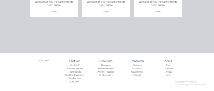
Here we used the bootstrap grid system to create 4 columns in a 12 column row.
Let’s add our Footer.vue component to our App.vue to get it to show on every component across the site. Modify your App.vue and add the following:
import Footer from './components/includes/footer.vue'

export default {
  name: 'App',
  components: {
    Navigation,
    Footer //added footer component.
  }
}
Add the following to the template also:
<template>
  <div id="app">
    <navigation/>
    <router-view></router-view>
    <Footer/>  //footer component utilized

  </div>
</template>
Our nicely styled footer:
Conclusion:
Bootstrap is a wonderful way to build content for the web with its predefined class names that provide a solid foundation for us to build on. Vue.js on the other hand, it is a life-changer for every developer using it.
You can find the source code here on GitHub

